Medspa website design and branding
Luna Aesthetics & Wellness
Britni came to me looking for a complete rebrand along with a website to make her brand as a whole feel trustworthy. She had the goal of becoming recognizable in her community and ultimately becoming the go-to medspa in her county. Just about four months after launching her rebrand, she’s been nominated for two awards (best medical spa and best cosmetic center) in the Tri-State’s Best Community’s Choice Awards!
VIBE: sleek, minimalistic, luxurious, elegant
SCOPE OF WORK:
Full branding
Squarespace website design
Prompted filler text & suggested copy


AFTER
BEFORE


BEHIND THE DESIGN
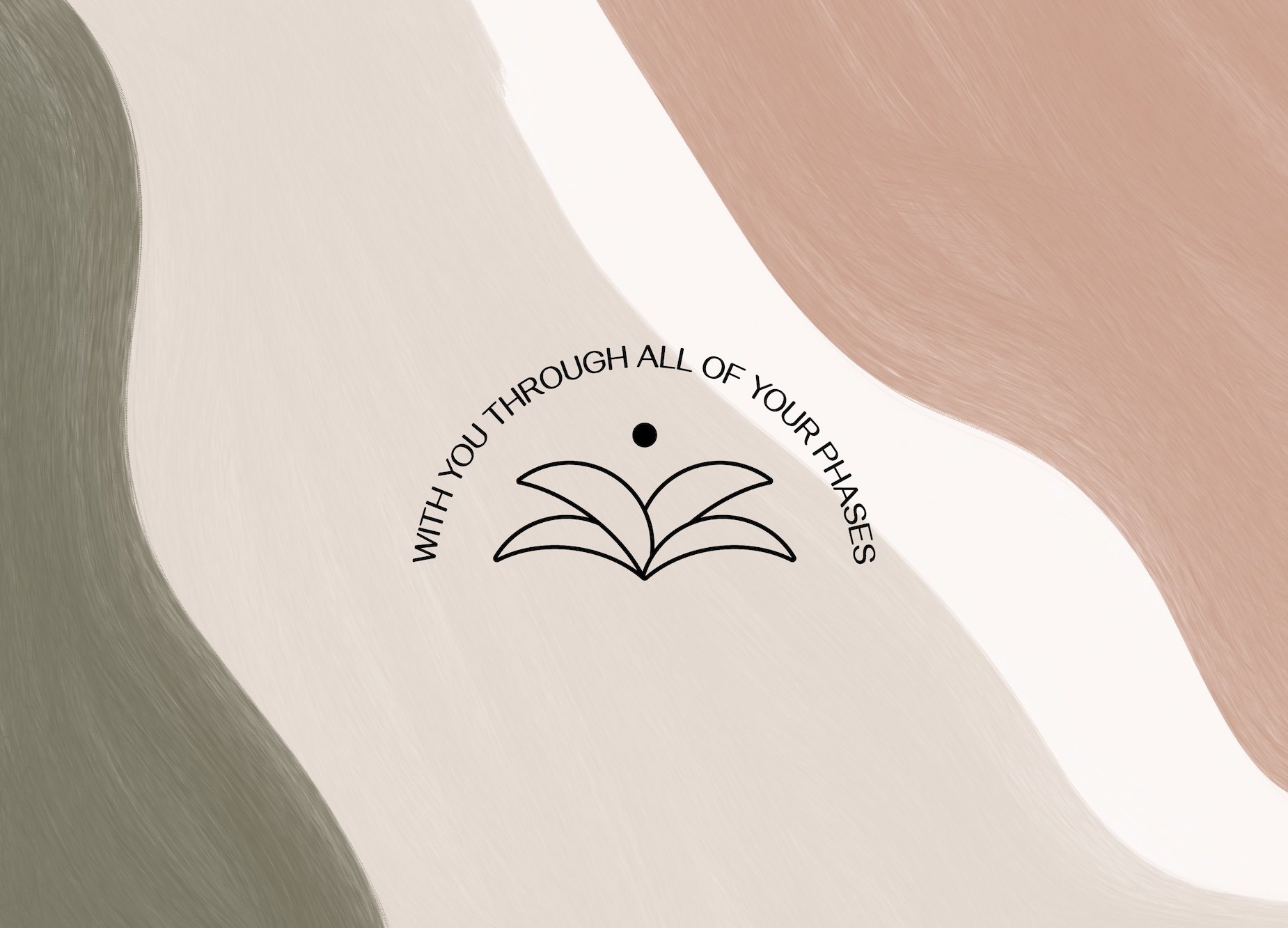
Various phases of the crescent moon are incorporated throughout the logo suite to tie into the brand name and symbolize the natural glow clients experience after visiting the medspa. Different crescent moon phases are used because, when the moon is in a crescent shape, it is either headed toward a new moon or has just begun a new cycle. This represents the client’s different phases of self and the confidence they gain with each visit.
The overlapping crescent moon phases also resemble a flower, signifying natural beauty, or an aloe vera plant, symbolizing wellness. Solid dots seen throughout the logo suite represent the new moon, symbolizing growth and transformation, which mirrors the client’s journey and evolving confidence.
STRAIGHT OUTTA BRITNI’S MOUTH
“You killed it! I couldn’t have thought of a more perfect, classy, sleek and EXACTLY what I was looking for logo and brand😭 This is why I knew you were the one for my brand and website. The meaning behind the crescent moons and ‘new moon’ that you chose could not have been more perfect. I am so in love!!”