real estate developer website & Branding Design
Ammil Development
With the goal of attracting investors for her first residential build of a ski-in, ski-out community in Utah, Chelsea from Ammil Development knew she needed to invest in custom branding and web design. She described the style of the community as “mountain modern meets hygge and old school skiing aesthetics” and wanted Ammil’s branding to depict this while still having a clean and professional look.
VIBE: modern + vintage, minimalistic + adventurous
SCOPE OF WORK:
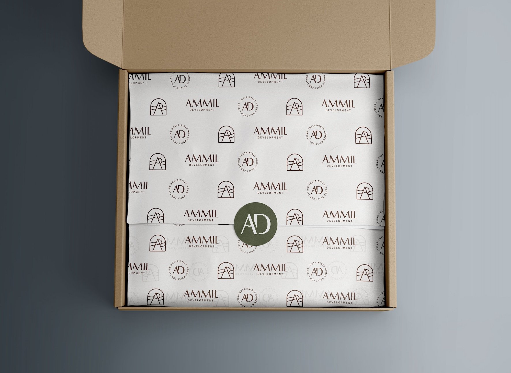
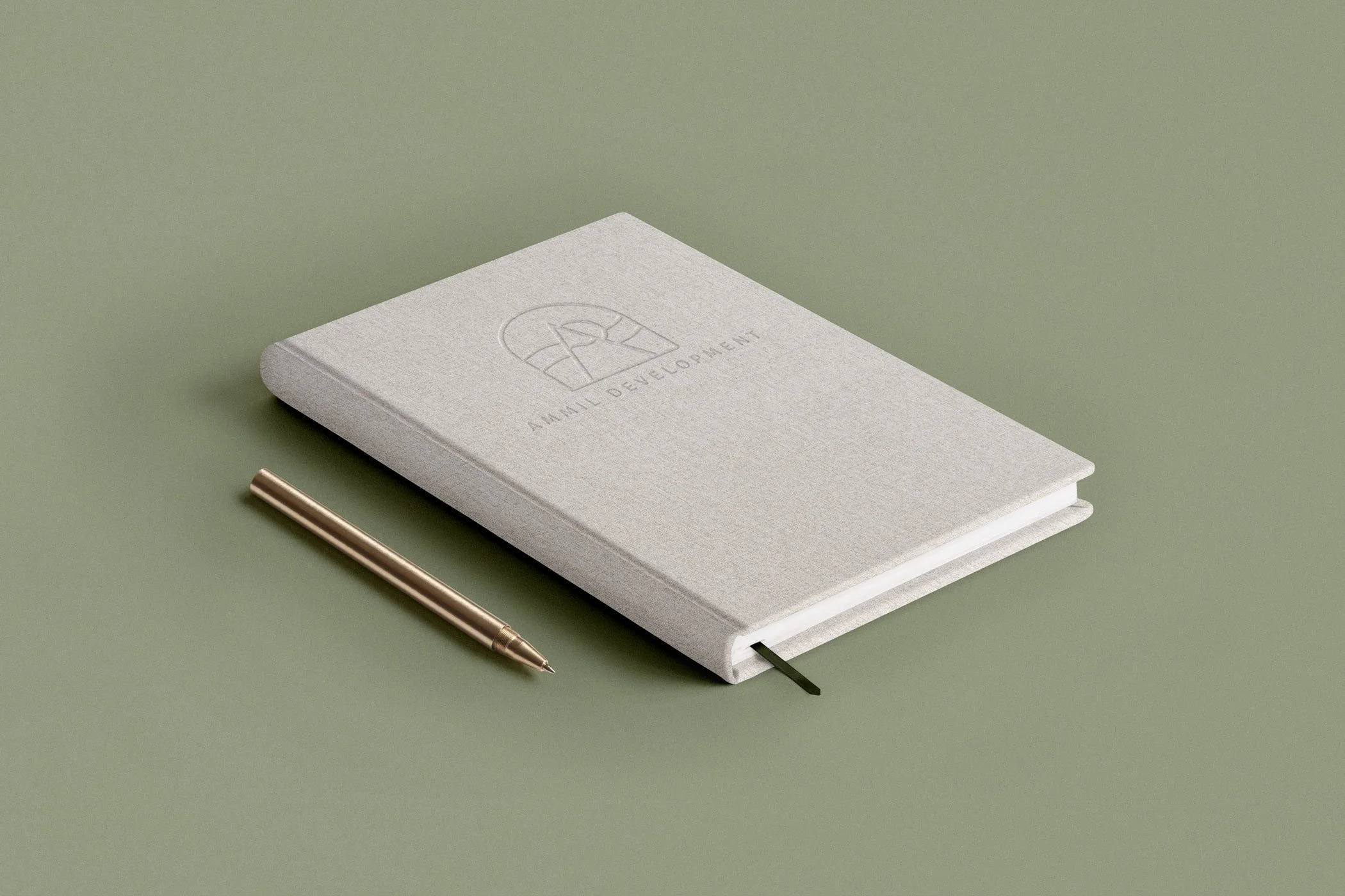
Full branding
Squarespace website design


BEHIND THE DESIGN
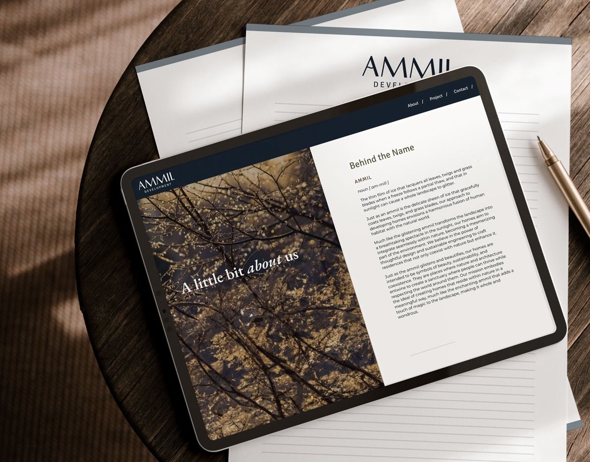
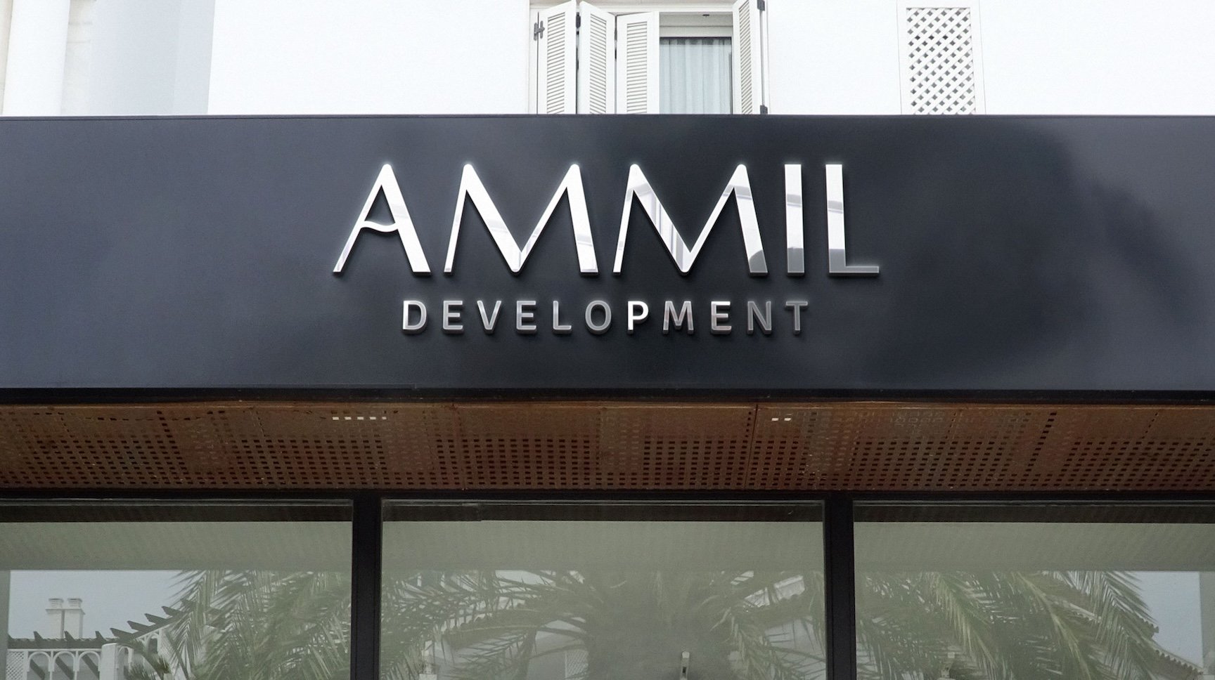
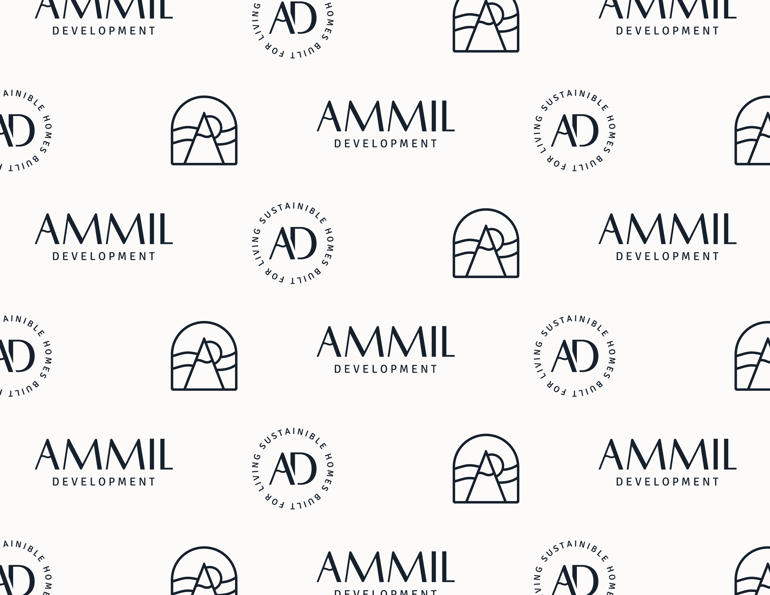
The word Ammil is defined as “the thin film of ice that lacquers all leaves, twigs and grass blades when a freeze follows a partial thaw, and that in sunlight can cause a whole landscape to glitter”. One of Ammil’s core values is working “with” nature rather than against it. Putting the two together, I was able to come up with a sleek, minimalistic logo that uses a snow-capped mountain for the letter ‘A’.
The logomark uses the brand’s initials, with ‘A’ being the snowcapped mountain and ‘D’ being the sun peeking out from behind it, with a trail in the background. This is all placed within an arch to appear as a window and communicate the “picture-perfect” views of nature that are a huge part of the community.

STRAIGHT OUTTA CHELSEA’S MOUTH
“Everything looks great! It’s actually quite close to what I had envisioned. My ideas always came out very generic and boring, so I love the added creativity.”